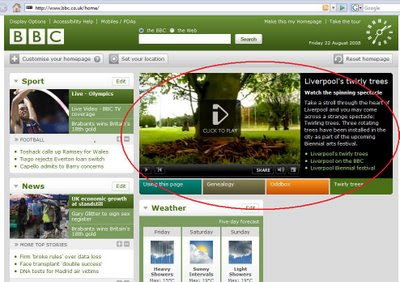
Sure, the new page features personalization in content and colour - buts that's pretty standard now. My big complaint is that although I can choose my content, I'm always stuck with this - for me - useless 'hero shot' wasting so much space.
 While I was on the site I was presented with three other 'pictures' and none of them had any interest to me whatsoever. Seems to me that it is a waste of prime online real estate.
No comments:
Post a Comment