These are some of my views on this digital marketing malarkey ... there's more on: AlanCharlesworth.com

Over the years – as you can see – I’ve added to this blog only sporadically. I decided to leave all the old posts ‘live’ as I think they can still be useful in helping folk understand digital marketing.

Oh ... and I write all of these entries myself. There's no AI used on this blog.

Enjoy 😊

Monday, September 17, 2018

It's déjà vu all over again

I thought this had been sorted 20 odd years ago. We certainly sorted it on the e-commerce sites I worked with 20 years ago. Though I do recall one of the budget airlines having this issue in recent years?

The problem is this: you click on the final link of a purchase [eg 'pay'] ... and nothing happens. 

Sooooo ... you do not know if the transaction has gone through. Do you click again - and take the chance of making two purchases? Or do you assume it's gone through and await a confirmation email [if they send one] - or access your bank/credit card account to see if the money has been removed?

That's what happened when I tried to book a room with Premier Inn.


Yes, that would be the same Premier Inn that spends a significant amount of money on TV, print and online advertising.

And that advertising all drives you to the website to book a room.

Which might not work properly.

Ho humm.

Monday, September 10, 2018

Another techie vs customer ... and customer loses

I've used Firefox browser since it first came out - mainly because it has the best security of the browsers. However, this security sometimes blocks sites. I also run ad-blockers on Firefox browser - which also means the content of some sites is blocked [I assume the software interprets the images as ads].

I accessed a certain page on Firefox. There was an instruction to 'Please select a visual...' - but there were no 'visuals' [I'm going to assume that 'visual' is techie-speak for 'image' or 'picture']. Blocked by Firefox, I assumed. Note that I can put a 'visual' on my website that won't be blocked on Firefox, so it must be possible. Of course, I use simple HTML, nothing technically fancy ... Oh, and Firefox is the chosen browser of around 10% of PC users. Could any business afford to have a 'go away' sign on their door that would be seen by 10% of their customers?

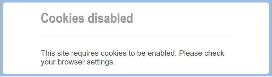
So I put the URL into  Both Microsoft edge and Chrome [the brand leader at around 65%] - and in both got this message ...


Here's the thing: On neither of these browsers do I have the cookies disabled.

This is not my - the customers' - fault.

Neither is it the fault of the browsers. They only 'read' the code of the website ... and something in that code is wrong.

It is the fault of the website's designers/engineers. If the software they are using isn't liked by browsers, they should change it to something that liked. 

But here's the kicker.

Website designers/engineers - those  with computer science qualifications - don't like to 'dumb down' their work. That is beneath them. They want to be seen as being on the cutting edge of technology.

The irony is that they blame everyone else when they are made redundant.

If customers can't get in, there's no money to pay their wages.

And for any doubters reading this: I just went on Amazon in all three browsers. Every page worked perfectly. 

Amazon's not doing too badly for itself.

I rest my case.

FOOTNOTE: 
A few minutes after posting this, I came across ... BA customers complain of having to check out of adblockers to check in for flights

UPDATE:  and another example ... the screenshot on the top is from Firefox, the bottom one from Chrome


Sunday, September 9, 2018

Techie vs customer ... and customer loses

Computer scientists can do wondrous things with technology.

They can, for example, make software recognise whether or not the same letter is in upper or lower case. It can then determine that for purposes of identification, upper and lower case are the same thing.

They can do that easily.

If the purpose requires that letters are either upper or lower, they can even tell their software to convert the 'wrong' case to the 'right' case.

And they can do that easily.

Now look at the issue from the view point of customer usability. That is; make the procedure as easy as possible for any and all users to complete.

That, of course is the view of the marketers and sales folk. Because guess what? That's where the money that pays their wages comes from.

The irony is that too many computer scientists 'get' that minor detail. 

Worse still; if any of the 'techies' responsible for developing the online survey for Trinity McQueen shown below reads this blog entry, they will probably call me an idiot for using lower case letters in my postcode.


Footnote: I hit delete and didn't complete the survey. Loss to me? Zero. Loss to the organization? A completed survey ... for which they had emailed me personally and asked would I mind completing it. 

And if this had been the form for the delivery address of a product I had in my shopping basket? And I deleted it and went to another seller? 

Us customers can be funny folk ... but we pay the wages.

Oh, final note. Marketers - check what the computer scientists are doing with your marketing before you make it available to customers :-)

Friday, September 7, 2018

If your website doesn’t work on my screen, it’s not my fault … it’s yours


I came across the website for totrain.co.uk. 
Here’s how their ‘about us’ page looked on my PC’s screen via Firefox.


In case you can’t read it clearly, the words above the blank space say:
 

                         Places We’ve Worked
 
Hmmm?

The Blank of England? [thank you Spike Milligan]
 

I checked it out on Microsoft Edge and there was an interactive map. I’m guessing it’s the computer science behind the ‘interactive’ bit that’s causing the problem.
 

Two points:
1    Would the Firefox-using potential customer have opened up Microsoft Edge?
2    This organization [it would seem] offers e-learning. That is, learning via the Internet. And they can’t make their website work properly.


Hmmm [again] 

Monday, May 28, 2018

Saga … how to win leads but lose customers

It's that time of year when  need to renew my car insurance. Obviously, I had a shop around online to see if there was a better deal than the renewal quote from my current insurer.

One such potential provider was Saga. Some way into the 'customer details' form I came across this ...


Now ... it is an old sales trick to offer the customer two alternatives knowing that whichever the customer picks, you make a sale. But really - lots of emails in your inbox from Saga or just a few is not an option. Where is the 'none' choice?

 Just out of interest, I clicked on 'insurance', and got this ...


Yep, to stop the emails you have to ring them up [actually, you don't - all marketing emails must have an 'unsubscribe' option included within them, but that's not the point].

A couple of additional things to note here:

1 Check out just what percentage of TV ads are for insurance price comparison sites or insurance companies - there is a lot of money spent to get people to visit websites where they can ask for a quote. If the above happens, all of that money is wasted.

2  I'm already a customer of Saga for another insurance product - they already send me marketing communications. So why didn't their software recognise me when I was filling in this form?

Oops, nearly forgot the main message of this posting - particularly for Saga - I stopped my request for a car insurance quote at that point.

Saturday, March 17, 2018

Adidas: can I introduce you to segmentation ...

Forget digital. Forget programmatic. Forget artificial intelligence.

I got this ad in an email...


A) The only thing I have bought from adidas is from their 'classic' range.

B) What makes adidas think I'm in the target segment for this product anyway?

Saturday, March 10, 2018

Email ... still a third class citizen

Seven - yes, 7 - working days to respond. And that was after spending nearly an hour to find an email address on the site [it became a challenge].

And check out the broken image.

Oh, and if you didn't know, The Google Digital Garage is the home of Google's digital marketing training/qualification.

Ho hum


Sunday, March 4, 2018

Wednesday, January 31, 2018

Bribery and corruption? II

More by way of 'paying for a review' ... and another example 'what's to review?' 

It's a water filter - it filtered the water


Tuesday, January 16, 2018

Bribery and corruption?

Give us feedback and we will pay you for it. 

I bought an adidas jacket last week and received this email today.

Is this an ethical way of collecting reviews?

Monday, September 18, 2017

Too far?

For the last 20 years I have been a proponent of websites being simple - it increases the UX. However, has Balenciaga gone too far?


Even my KISS attitude thinks that for this particular company, this may be a tad too far – the key reason being that Balenciaga is selling a product [clothes] that have an aesthetic appeal and so images may draw customers into the 'shop' – such a 'minimalist' approach might better suit a ‘soulless’ product such as government departments [Gov.uk. for example].

That said, perhaps 'minimalist' non-conforming to couture norms is the Balenciaga brand – and so the site makes sense. Note how on pages where the clothes are shown, the models have a distinctly ‘un-glamorous’ pose, and that the site lacks many of the ‘normal’ content, e.g. ‘about us’. I can find little about the company – but as their only outlets in the UK are in Knightsbridge, Covent Garden and  Mayfair, I suspect the brand is very much up-market. If anyone's visited one of these shops I would be interested to know if they are as minimalist as the website.

However, although the first visit to the Balenciaga.com is a bit of a shock – in subsequent visits you just click on the relevant word on the screen: job done.

As far as I know, this site went live in 2017 – check it when you read this to see if it is still as shown above ... or whether Balenciaga's nerve has broken.


Friday, September 15, 2017

My house, my rules

Many organizations, including several universities, use third party websites as part of their marketing. One example of such sites is issuu.com that facilitates offline catalogues to be reproduced online in a click-to-turn-the-page fashion. Whilst these are aesthetically very good, in usability terms they are a disaster. 


On a PC screen, the default is screen size which is about the same size as the printed version. But we can hold the printed version nearer or further away to suite our eye site. Make the screen image bigger and you have to scroll around the page as the text goes off of the screen. Try it on your smart phone – the device of choice for a university’s target market. 

For 20 years I have said ‘do not simply reproduce offline content for online, it is not read in the same context’. This is still true. 

Also, simply reproducing the offline version online means you lose that great tool of the Internet – the hyperlink. In an offline publication you have to say; ‘if you want to apply; ring this number/copy type this address into your email/go to this website’. In sales terms, these are all barriers. Online you say; ‘click here’. 

Furthermore, take another look at the image. Notice the ‘ads’ to the right of the ‘publication’ area? Yep, people search for your prospectus on Google – and issuu.com help YOUR prospects to find another seller. D’oh! 

These are reason enough not to use this method to publish online – but there is also the ‘my house, my rules’ issue. Take a look at issuu.com’s terms and conditions. Oh dear. They have total control over everything published on their domain. Hmmm ... is that what you want for your marketing content? 

So why do organization’s use the likes of issuu.com? In this instance I suggest it is [a] the novelty of the click-to-turn-the-page facility [bells-and-whistles syndrome], and [b] easy to use – you upload the digital version of the printed brochure and issuu.com does the rest. 

But if you have the digital version of the printed material [every publication starts in digital format], why not convert it to html and put it on your website? You won’t get that fancy aesthetic of the page turning, but you can insert hyperlinks – and users will be able to read the words [that is why users are there] on any device . 

Out of interest, I put “University of Sunderland International Prospectus” into Google – and the issuu.com page was fifth in the SERP listing – which isn’t bad. But the first four were all pages on sunderland.ac.uk. If the online-prospectus is on your own domain then you have potential customers coming into your 'shop' where they can see your sales pitch and you can capture their details – and there are no ads for your competitors’ products because it is your site, so they are your rules. 

Ho hum.

Friday, September 1, 2017

Bribing reviewers

In my classes I have an exercise to identify legitimate ways of 'encouraging' customers to leave reviews.

This is not such a case.
It is an attempt to bribe customers to leave 5-star reviews. Long term; it is not good practice and it will come back to bite any organization who uses it.

Note: I deleted the name of the company - and am I the only one who thinks that this looks like a template for this message which each organization can add its own details? If so, who provided the template ... surely not eBay or Amazon?

Thursday, August 17, 2017

You're not coming in here using that

If you are going to provide a service - to external or internal customers - make it as easy for them ... and don't dictate how they go about it.
 

This is like security telling a potential customer they cannot come into a shop wearing the 'wrong' shoes. 

But it gets worse ... this is what happened when I tried to login using Firefox.


Friday, April 21, 2017

The boxes are ticked - but where's the fairy dust?

The Irish Fairy Doors Company is a very successful company with an interesting and innovative product. The culture of the organization comes across in the product and website, everything is just right for the target market [take a look on theirishfairydoorcompany.com].

In my books I cover the subject of email as a medium of carrying a marketing message - be it sales, branding or relationship building.

It is now pretty much standard practice to send emails confirming an order has been received/dispatched/delivered - so The Irish Fairy Doors Company ticked those boxes when I placed an order recently ...


The links to view order and visit our store were included - so more boxes were ticked there.

But I cannot help but think they missed an opportunity to engage with customers ... where is the message from the fairies?